






Marketingvorlagen für Makler, die lieber ruhig als laut wirken.
Marketing templates for agents who would rather look calm than loud
Die meisten Makler-Vorlagen sind darauf ausgelegt, aufzufallen. Knallige Farben, große Logos, jede freie Stelle auf der Seite. Das mag für manche Makler funktionieren – aber nicht für diejenigen, die durchdachte, ruhige Häuser an Menschen verkaufen, die vor der wichtigsten Entscheidung ihres Lebens stehen.
Also habe ich das Gegenteil gebaut.
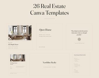
Ein warmer Sandhintergrund, fast schwarze Schrift, ein dezenter olivgrüner Akzent, Serifenschriften mit viel Freiraum und nichts auf der Seite ist überflüssig. Ich nenne es unaufdringlich redaktionell: Es wirkt wie der Immobilienteil einer guten Zeitschrift, nicht wie ein an einen Laternenpfahl geklebter Flyer.
SO ARBEITE ICH
Jede Vorlage wird in Canva von Hand gestaltet, Element für Element. Keine automatisch generierten Layouts. Ich verwende echte Fotos statt digitaler Bilder und beschränke mich auf zwei Schriftfamilien – Fraunces für Überschriften, Work Sans für alles andere –, sodass eine komplette Marketingkampagne wie aus einem Guss wirkt, ohne dass Sie sich darum kümmern müssen.
Sie benötigen lediglich ein kostenloses Canva-Konto. Keine Designsoftware, keine zu installierenden Schriftarten, kein Abonnement zum Bearbeiten Ihrer gekauften Inhalte erforderlich.
ÜBER SPRACHEN
Ich lokalisiere die Texte sorgfältig, anstatt sie durch einen Übersetzer laufen zu lassen. Jede Sprachversion berücksichtigt die Gepflogenheiten des jeweiligen Marktes – Quadratmeter oder Quadratfuß, Notar oder Abschluss, Lakh oder Dollar und die tatsächlichen rechtlichen Schritte beim Hauskauf im jeweiligen Land. Ein übersetzter Flyer, der den falschen Ablauf beschreibt, ist schlimmer als gar kein Flyer.
WENN ETWAS NICHT PASST
Märkte sind unterschiedlich, und keine Vorlage ist für alle geeignet. Wenn ein Layout oder eine Formulierung in Ihrem Vertriebskanal nicht funktioniert, schreiben Sie mir bitte. Ich helfe Ihnen gerne weiter, anstatt dass Sie mit der Datei hadern.
Most realtor template packs are built to shout. Bright colours, big badges, every inch of the page filled. That works for some agents — but not for the ones selling considered, quiet homes to people making the largest decision of their lives.
So I built the opposite.
A warm sand background, near-black type, one restrained olive accent, serif headlines with room to breathe, and nothing on the page that isn't doing a job. I call it quiet editorial: it looks like the property section of a good magazine, not like a flyer taped to a lamppost.
HOW I WORK
Every template is laid out by hand in Canva, one element at a time. No auto-generated layouts. I use real photography rather than synthetic images, and I keep the type system to two families — Fraunces for headlines, Work Sans for everything else — so a whole marketing campaign holds together without you having to think about it.
You need a free Canva account and nothing else. No design software, no fonts to install, no subscription required to edit what you buy.
ON LANGUAGES
I localise properly rather than running the text through a translator. Each language version follows its own market's conventions — square metres or square feet, notary or closing, lakh or dollars, and the actual legal steps of buying a home in that country. A translated flyer that describes the wrong process is worse than no flyer at all.
IF SOMETHING DOESN'T FIT
Markets differ, and no template survives contact with every one of them. If a layout or a phrase doesn't work where you sell, send me a message. I would much rather fix it than have you fight the file.