Artículos destacados

Todos los artículos

Reseñas
-

-

Izzy el 19 ene 2026
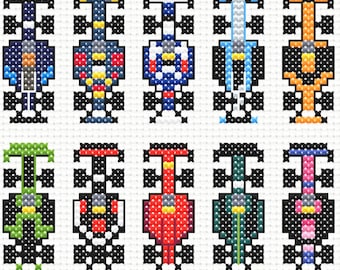
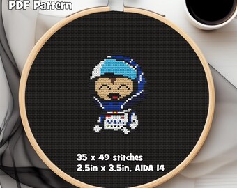
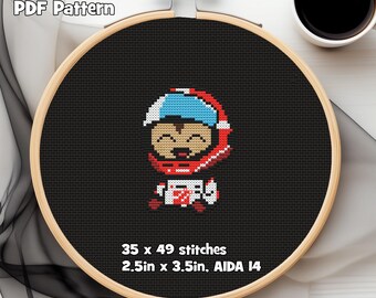
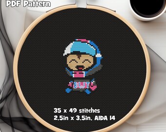
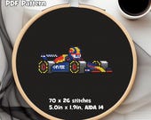
4 de 5 estrellasEl patrón quedó bien, pero era algo difícil de leer. Algunos tonos azules se habían transformado en morados en los colores del patrón (¿quizás para mayor contraste?). Sin embargo, debido a la alta saturación, me resultó difícil seguir la línea, incluso al marcar las puntadas completadas en el PDF. Algunos símbolos también estaban muy cerca (/, /, //), lo que dificultaba aún más seguir la línea mientras se cosía.
Michael respondió el 19 ene 2026
Thank you for the feedback! I'll adjust the symbols so that they're easier to differentiate. The render color of the blues is a bit tricky because it's just a baked-in color within the software I use, but I can begin including black and white versions of the patterns to help. I appreciate your feedback, it's very helpful!
Cargando

Presentación PolePositionPatterns
Políticas de la tienda
Formas de pago aceptadas