

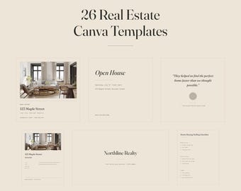


Marketing templates for agents who would rather look calm than loud
Most realtor template packs are built to shout. Bright colours, big badges, every inch of the page filled. That works for some agents — but not for the ones selling considered, quiet homes to people making the largest decision of their lives.
So I built the opposite.
A warm sand background, near-black type, one restrained olive accent, serif headlines with room to breathe, and nothing on the page that isn't doing a job. I call it quiet editorial: it looks like the property section of a good magazine, not like a flyer taped to a lamppost.
HOW I WORK
Every template is laid out by hand in Canva, one element at a time. No auto-generated layouts. I use real photography rather than synthetic images, and I keep the type system to two families — Fraunces for headlines, Work Sans for everything else — so a whole marketing campaign holds together without you having to think about it.
You need a free Canva account and nothing else. No design software, no fonts to install, no subscription required to edit what you buy.
ON LANGUAGES
I localise properly rather than running the text through a translator. Each language version follows its own market's conventions — square metres or square feet, notary or closing, lakh or dollars, and the actual legal steps of buying a home in that country. A translated flyer that describes the wrong process is worse than no flyer at all.
IF SOMETHING DOESN'T FIT
Markets differ, and no template survives contact with every one of them. If a layout or a phrase doesn't work where you sell, send me a message. I would much rather fix it than have you fight the file.