
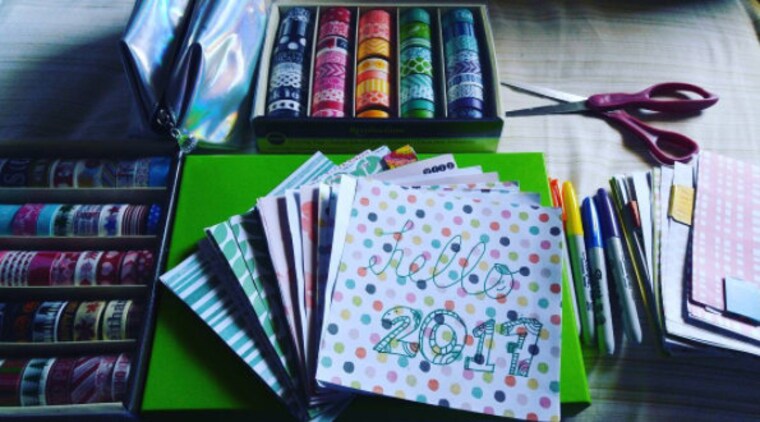
Todo comenzó con el DIY 2017 Planner y un juego llamado Cards Against Humanity. En algún momento alrededor de la última semana de diciembre de 2016, finalmente decidí hacer mi propio planificador y transmitirlo en Afreeca Global TV para no salir corriendo. Estoy muy agradecido con Afreeca Fam. por apoyar mis esfuerzos y alentarme en el camino. Por lo general, hago mis bricolajes por diversión y estos productos son los frutos de mi trabajo de amor.
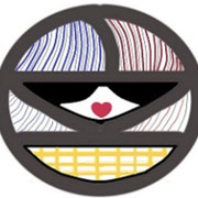
La historia detrás del logotipo de la tienda es bastante simple, realmente siempre he querido crear uno e integrar quién soy como persona. Trato de poner tantas imágenes ocultas / no tan ocultas como sea posible. Los colores significan mi etnia y mi país de origen también donde estoy en este momento. Las curvas de líneas coz en la vida no hay tal cosa como una línea recta / camino que tienes que seguir. Tienes que adaptarte a los tiempos y ser lo suficientemente flexible como para hacerlo. Me gusta el patrón a cuadros que se siente atemporal para mí y me gusta cómo las líneas se unen porque no hay tal cosa como la coincidencia en la vida que todos tenemos que conocer en un momento y puede que algunas personas vayan y vengan en nuestras vidas al igual que cómo cambia la temporada y cómo algunas personas están destinadas a quedarse. El Círculo que siento que es una forma tan abierta que no hay borde que me recuerde ser de mente abierta. El Corazón es para el amor como solían decir haz lo que amas y nunca trabajarás otro día en tu vida. Me gustaría crear tantas variaciones de esto como sea posible, como tal vez una diferente para cada día festivo o como cambios de temporada que aún no conozco ... sigue siendo un trabajo en progreso
It all started with the DIY 2017 Planner and a game called Cards Against Humanity. Sometime around the last week of December 2016 I've decided to finally make my own planner and stream it at Afreeca Global TV so I won't wuss out.I'm really grateful to the Afreeca Fam. for supporting my endeavors and encouraging me along the way.I usually do my DIYs for fun and these goods are the fruits of my labor of love.
The story behind the Store logo is quite simple really I've always wanted to create one and integrate who I am as a person. I try to put as many hidden/not so hidden images as possible. The Colors signifies my ethnicity and home country also where I'm at at the moment. The Lines curves coz in life there is no such thing as a straight line/path you gotta follow.You gotta adapt to times and be flexible enough to do so.I like the plaid pattern it feels timeless to me and I like how the lines meet together coz there is no such thing as coincidence in life we all gotta meet at one point and mayhaps some people come and go in our lives just like how the season changes and how some people are meant to stay.The Circle I feel like is such an open shape there's no edge which reminds me to be open minded.The Heart is for love like they use to say do what you love and you'll never work another day in your life. I would like to create as many variations of this as possible like maybe a different one for every holiday or as season changes I don't know yet...its still a work in progress
