

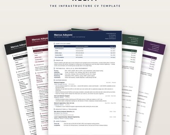
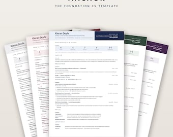
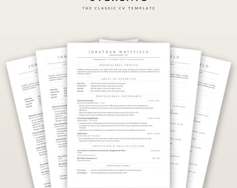
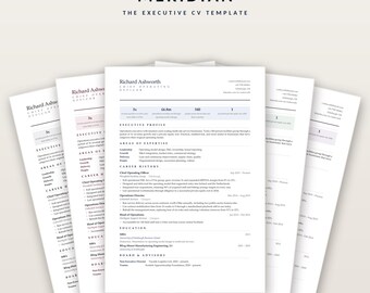
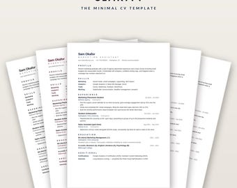
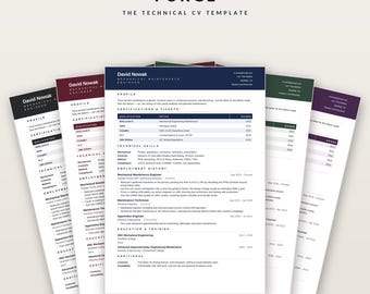
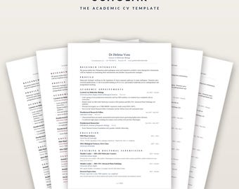
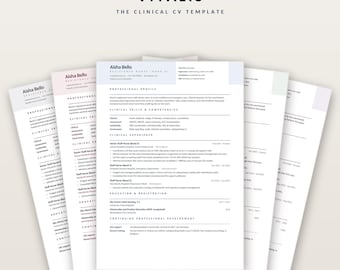
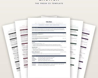
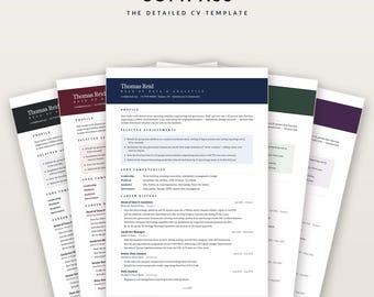
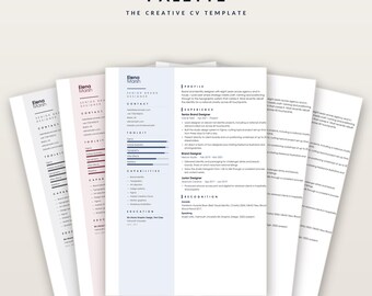
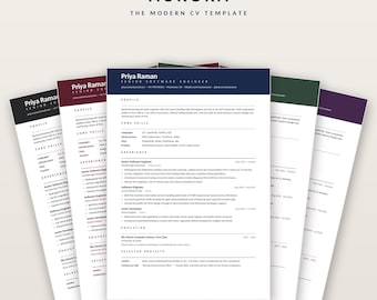

I make CV templates for people who get about five seconds to make an
impression.
That figure isn't a slogan. It's roughly how long a recruiter spends on a
first pass through a stack of applications — and before that, most CVs aren't
read by a person at all. They're read by an applicant tracking system:
software that pulls your document apart and files the pieces into a database.
If the layout confuses it, the application is over before anyone has seen
your name.
That's the problem these templates are built around, and it's why they look
the way they do.
DESIGNED FROM SCRATCH, NOT ADAPTED
Every layout here is built from nothing — the typeface, the spacing, the
alignment of the date columns, the weight of every hairline rule. None of it
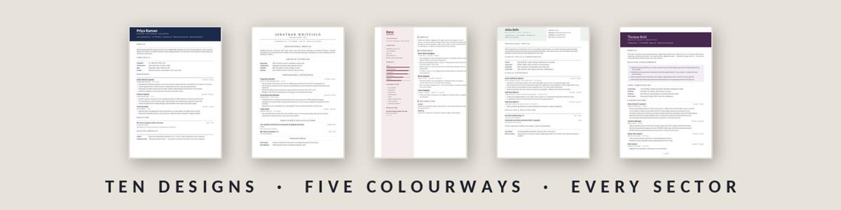
is a stock template with the colours swapped. That's why there are ten
designs rather than a hundred: each one is aimed at a particular kind of
work, with sample content written for that sector, so you can see the length
and the tone that actually lands.
THEN TESTED, WHICH IS THE PART MOST TEMPLATES SKIP
A design can look immaculate and still fall apart the moment software reads
it. So every file goes through the same checks before it goes on sale:
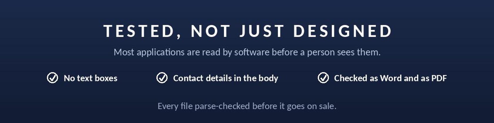
- No text boxes, anywhere. Text inside a text box is the single most common
reason a CV arrives in an employer's database blank.
- Contact details kept in the body of the document, never in a header or
footer, because many systems skip those entirely.
- Conventional section headings — Experience, Education, Skills — the words
the software was built to recognise.
- Checked as a Word file and again as an exported PDF, because a PDF is what
you actually send and the two fail in different ways. Wide letter-spacing
that looks elegant on screen can turn a heading into "E X P E R I E N C E"
once it is exported, which no system reads. The spacing in these files is
held below that threshold on purpose.
I'd also rather tell you which design is the safe choice for a large
corporate portal and which one suits a creative studio than pretend they're
all the same. Every listing says so plainly, including where a design is the
riskier option.
BOTH PAGE SIZES, BOTH TESTED
Every design comes in five colourways, and every colourway in both A4 and US
Letter — laid out and page-tested in each. US Letter is about 18mm shorter
than A4, so a layout that fits one doesn't automatically fit the other. Most
templates hand you a single size and leave you to convert it, which is how a
one-page CV quietly becomes two.
A GUIDE THAT ACTUALLY HELPS
Every download includes a written guide for that specific design: how to edit
it in Word, Pages, Google Docs or LibreOffice, how to change the colours,
every hex code if you need to match a company's brand, how to add or remove a
section, and what to do when something misbehaves.
If anything doesn't work the way the listing describes, please message me
before leaving a review. Almost everything is a two-minute fix, and since I
built the file I know exactly where to look.
All items
About TheFosterFile
Sales
0
On Etsy since 2026
Shop policies
Last updated on
Accepted payment methods
Accepts Etsy Gift Cards and Etsy Credits
Returns & exchanges
See item details for return and exchange eligibility.