
Featured items

All items

Reviews
-

-

Izzy on Jan 19, 2026
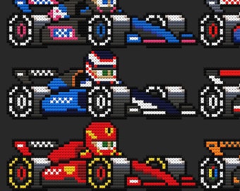
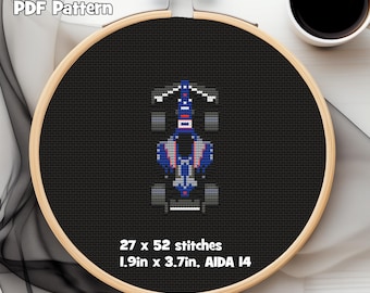
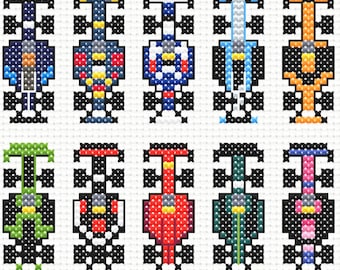
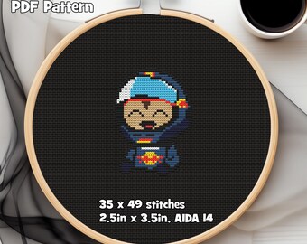
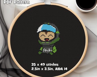
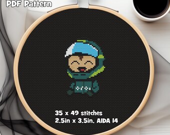
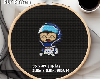
4 out of 5 starsPattern turned out well, however it was somewhat difficult to read. Some of the blues were shifted to purple in the colors for the pattern (presumably for higher contrast?) but I found that coupled with the high saturation it was difficult to keep track even while marking completed stitches on the pdf. Some of the symbols were also extremely close ( |, /, //) further making it hard to follow along while stitching.
Michael responded on Jan 19, 2026
Thank you for the feedback! I'll adjust the symbols so that they're easier to differentiate. The render color of the blues is a bit tricky because it's just a baked-in color within the software I use, but I can begin including black and white versions of the patterns to help. I appreciate your feedback, it's very helpful!

About PolePositionPatterns
Shop policies
Accepted payment methods