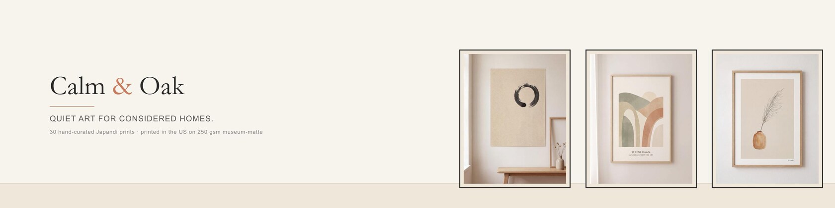

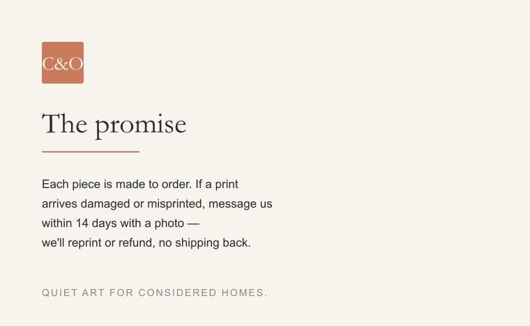
Quiet art for considered homes.
Calm & Oak makes prints for rooms that don't shout.
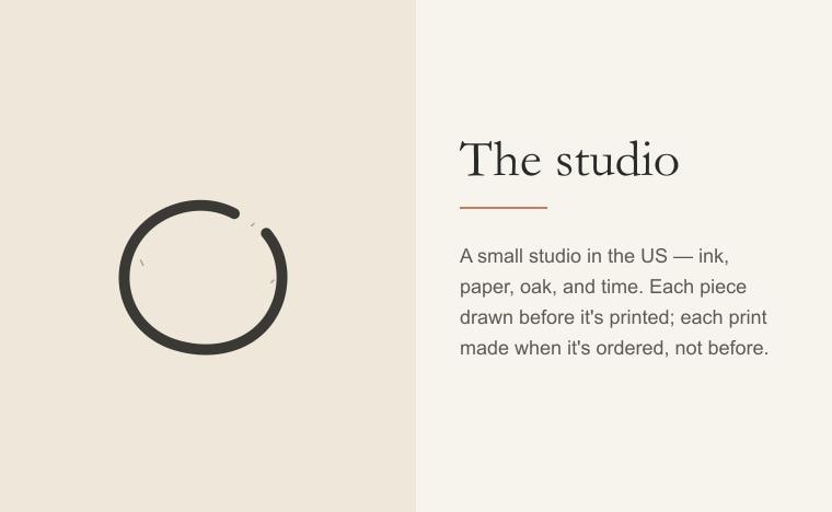
I started this studio because I wanted art that earned its wall space — pieces that hold a room rather than fill it. The aesthetic is Japandi: the Japanese discipline of negative space and ma (the considered pause) meeting the Scandinavian respect for natural materials and quiet color. None of it is loud. All of it is intentional.
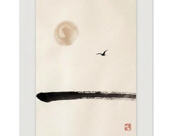
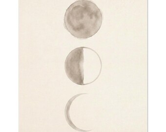
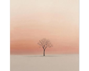
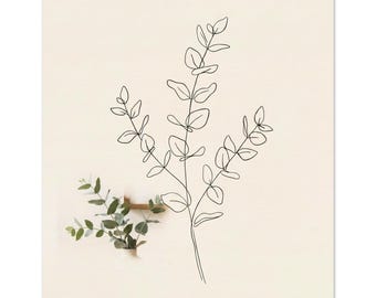
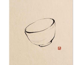
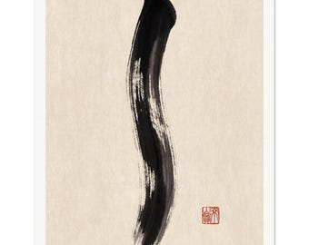
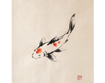
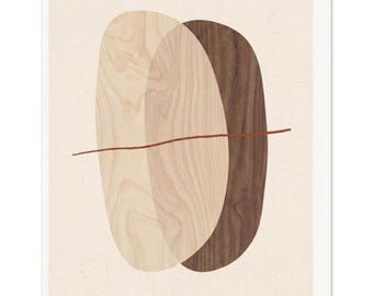
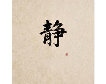
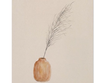
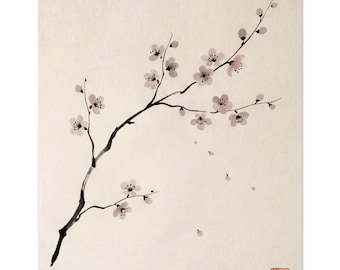
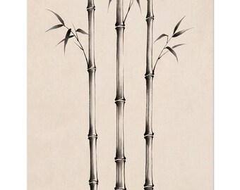
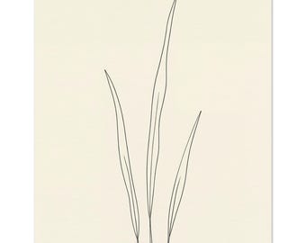
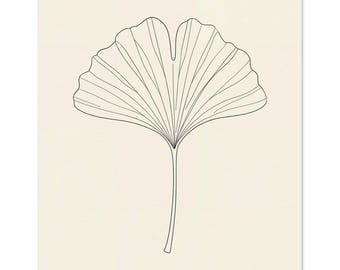
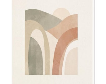
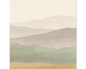
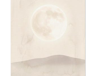
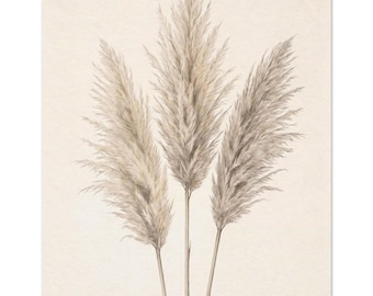
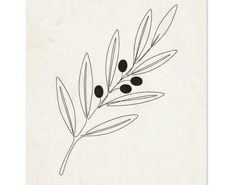
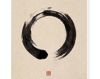
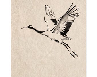
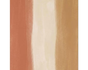
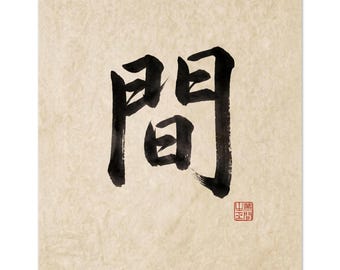
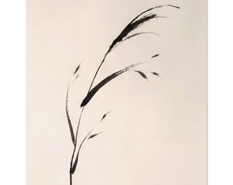
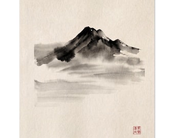
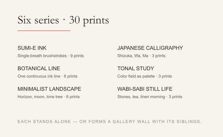
The collection runs across six series. Sumi-e ink — single-breath brushstrokes in the Japanese tradition, with a vermillion hanko seal. Botanical line — one continuous ink line for a stem, an olive branch, a ginkgo leaf. Minimalist landscape — a soft horizon, a moon, a lone tree. Japanese calligraphy — Shizuka, Wa, Ma. Tonal study — oak and walnut, sage and stone. And wabi-sabi still life — three stones, a tea ceremony, light through a linen curtain.
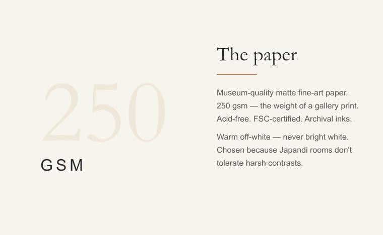
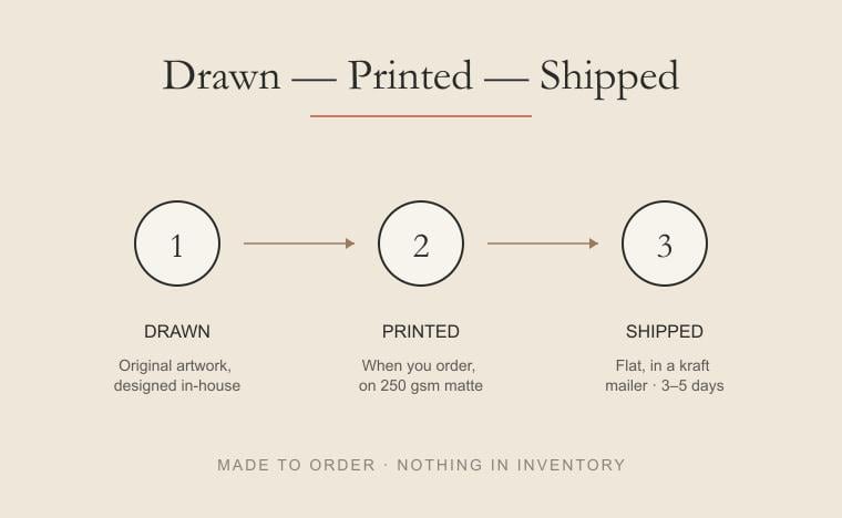
Every print is hand-illustrated and produced on 250 gsm museum-quality matte paper — acid-free, FSC-certified, archival inks. Printed in the US and shipped flat. The paper is warm off-white, not bright white — chosen because Japandi rooms don't tolerate harsh contrasts.
Each piece stands alone or pairs into a gallery wall set. The set listings ship the three prints designed to balance together, at a saving over buying individually.
If you have a question about a piece, the paper, or a custom size — message me. I read everything.
— Calm & Oak