

White Type on Top of Dad's Photos
My dad, Elmer Yochum, is an award-winning creative director who conceived TV commercials, product packaging, and print advertisements. From when I was little, Dad would show me clean, uncluttered, and beautiful products he designed, which used photographs and illustrations from the best artists in the business.
I am nowhere near the level of my dad, but I'm pretty good at putting things on a page, which I enjoy. My biggest motivation has always been to come up with products that didn't look like anyone else's. I have a lot of photos, but why would anyone buy mine? Photos are everywhere...same thing with black-type-on-white calendars and planners.
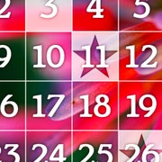
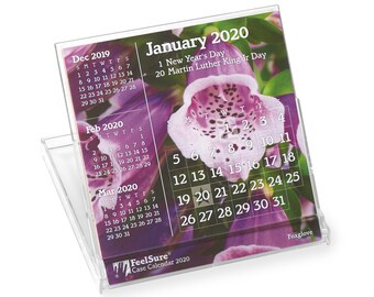
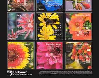
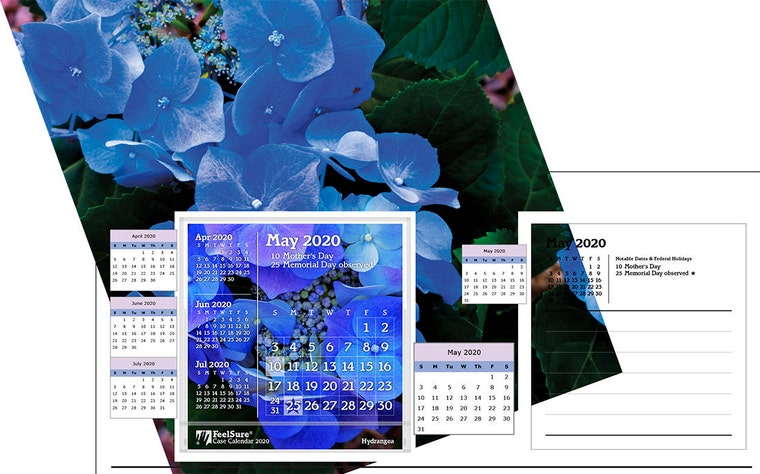
But, taking all the information you might find in any calendar, then laying it on top of photos, using white type, isn't everywhere. The layering allows the viewer to enjoy the beauty of the photo at the same time he or she is referencing the information. This synergy isn't found in photo-over-here-type-over-there products.
Good idea, but not that simple. The photo can't make the type unreadable (lighter-shaded flowers or cacti with all the needles). It also needs to create an interesting composition of lines and shapes; all flower pictures aren't interesting. So the percentage of pictures that work is a very small portion of the entire catalog of Dad's photos. Thus we are constantly adding to the catalog.
My name is Christopher Yochum (the CY in See Why), and I am so indebted to my dad for teaching me everything I know about graphic design.
